


Tests de mises en application des couleurs et de la charte graphique.
FR
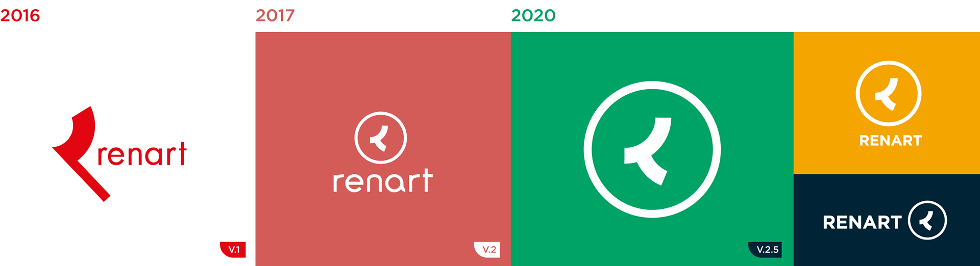
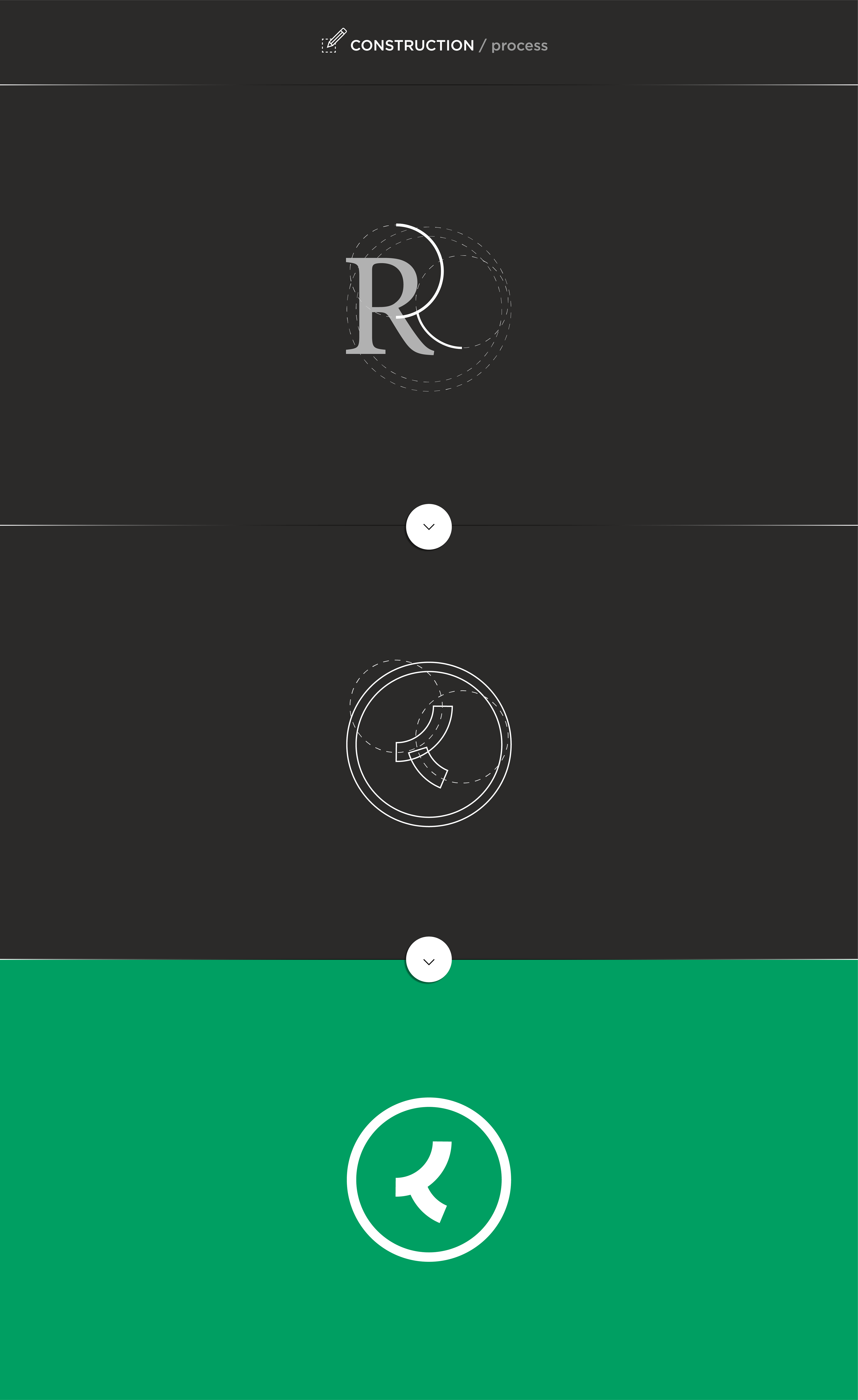
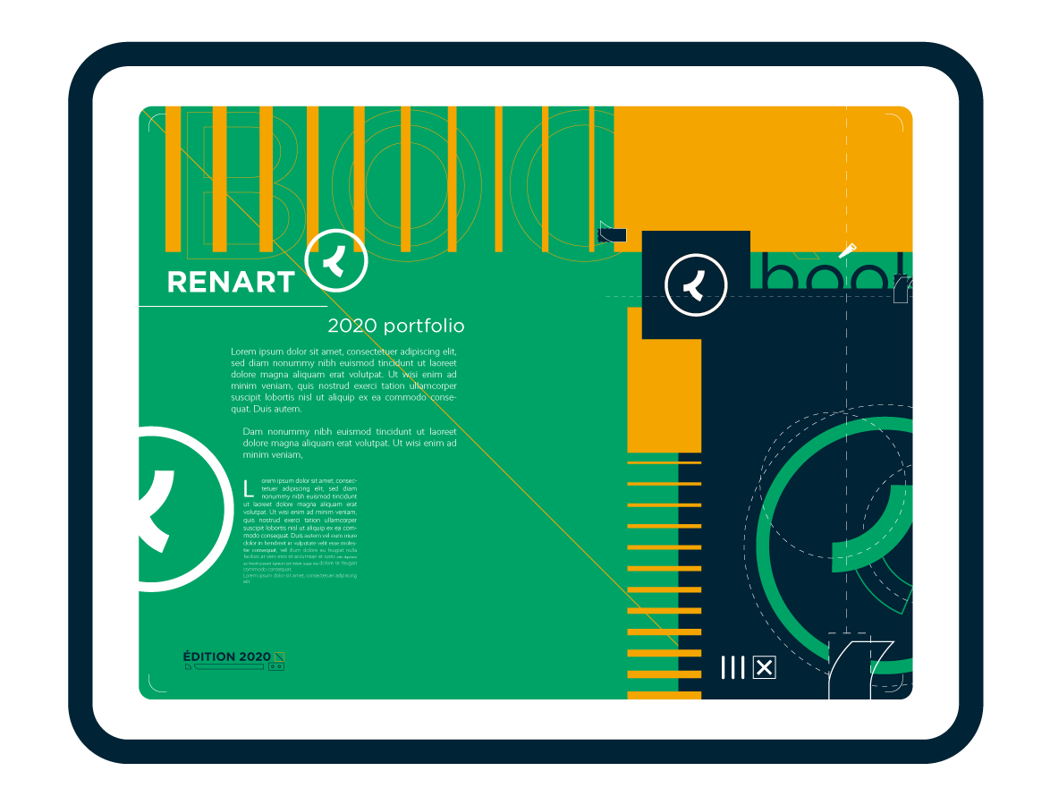
Création de mon logo "Renart" en 2016.
Première refonte graphique en 2017 avec pour objectif de synthétiser et épurer au maximum l'ésthétique tout en conservant l'essence du design. Les épaisseurs sont fixes, le dessin plus net et l'aspect général plus souple et arrondi. Le défi est de moderniser et rendre le logo plus intemporel.
Dernière mise à jour début 2020 : La typo (précédemment d'inspiration Futura et redessinée manuellement) devient une Gotham Bold, plus droite et structurée pour mieux asseoir et compléter le motif, et les couleurs et la charte graphique sont développées pour mieux correspondre à mon identité.
EN
Created in 2016, I reworked my personal logo a year later, reviewing its aesthetic and color for a smoother and more readeable approach, while conserving the essence of it.
This is 2020 and I thought it was time to update it once again, this time focusing on defining a little better the environment around the brand and the colors that matches its/my identity. The typo, originally inspired by Futura and drawn by hand, is replaced by the Gotham (Bold), more structured and fit, in opposition to the roundness of the circled "R".